PayPilot

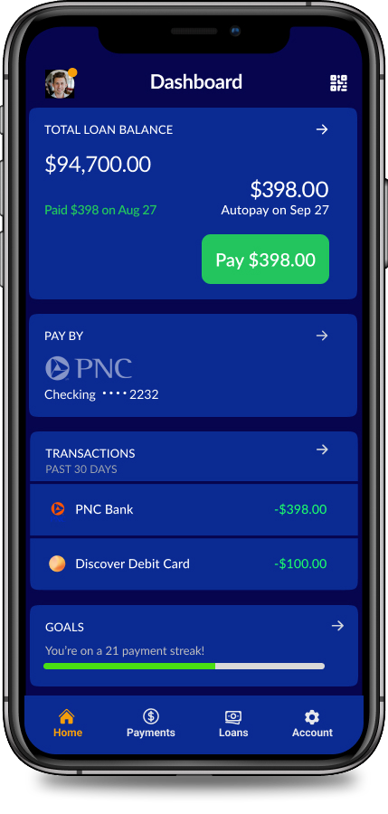
A mobile-first billing experience designed to reduce confusion and build trust, cutting call center volume by 62% and helping users manage payments confidently, even in low-light or on-the-go environments.

Role
Lead Product Designer
Timeline
5 weeks
Team
Product Manager
Call Center Reps
Platform
Mobile-first site

The Problem

Confusing payment flows were flooding the student loan call center with over 200+ support calls daily, mostly from users trying to complete basic mobile transactions. The legacy interface overwhelmed users with low contrast, outdated fonts, and unclear steps, leading to frequent input errors, late fees, and a growing trust gap.

The Opportunity

Design a mobile payment experience so seamless, secure, and clear that users could complete payments in under a minute—without needing to call for help.


How might we make paying off loans feel empowering,
and less like a punishment?

Strategy

To get there, I designed around four key principles:

  • Clarity above all: Show exactly what’s due, when, and why
  • Design for focus: Eliminate clutter, simplify actions
  • Secure, not stressful: Build trust into every tap
  • Accessible in the real world: Dark mode, fast feedback, flexible entry points
Key Design Decisions

Simplify the Flow

The original payment flow appeared to have only three steps, but each one contained multiple fields, decisions, and unclear branching logic.

I broke the flow down to its true task structure, then rebuilt it around a clean, progressive disclosure model:

  • One clear decision per screen
  • Preloaded account data and saved payment methods
  • Predictable defaults to reduce hesitation
  • Clear feedback and inline help where needed

The result? A flow that was truly simple—not just labeled that way.

Rebuild for Real-World Clarity and Control

We layered in biometric login, one-time passwords, and session-limited encryption, all without interrupting flow.

Trust cues and success states gave users confidence without confusion.

Earn Trust With Transparency, Not Tricks

Clear pending states, trustworthy copy, and real-time confirmation gave users confidence, especially during the 3–5 day ACH processing window.

We introduced dynamic inline error feedback, auto-scrolling to fields, and in-place corrections—without clearing prior data.

Combined with dark mode defaults (after field testing for low-light readability), this led to a measurable drop in form abandonment.

The Bottleneck Was Uncertainty

One of the biggest friction points was in the uncertainty after tapping "Submit."

Because ACH payments can take 3–5 days to process, users were left in limbo: Was it successful? Was I charged? Should I try again?

This confusion triggered a surge of “Did it go through?” support calls and led to duplicate payments.

We introduced a simple pending state with crystal-clear messaging:

  • ✅ “Payment received. Processing can take up to 3 days.”
  • 🔄 Status banner with real-time updates: Pending → Posted
  • 📨 Email + SMS confirmations with expected posting date

This UX fix reduced support calls and restored user confidence during the most anxious moment in the flow.

Streamlined UX That Drove Real Operational Impact

82%

reduction in daily support calls

40%

faster transaction completion

27%

increase in user trust scores

Designed for Confidence, Not Just Completion

This project highlighted that even simple financial tasks carry emotional weight.

Users weren’t just making payments, they were navigating stress, shame, and tight margins.

Our biggest wins came not from visual polish, but from designing for how people actually live: late nights, bad lighting, shaky Wi-Fi, high stakes.
That meant rethinking accessibility, layering clarity into security, and making recovery feel like support instead of punishment.

This wasn’t just a redesign. It was a shift toward building systems that earn trust one tap at a time.